BIONAT Australia Pty Ltd is an innovative and unique customised packaging solutions company with a difference, specialising in honey-specific products including manuka honey consumable sachets & freeze-dried products.
Client
BIONAT
Design
Logo/Branding/
Visual Identity/
Web Design
Year
2021
Timeline
3 Months
Client Brief for the Branding Design
/Preferred Colours
Simple, vibrant, and soft pastel colors stand out the most.
/Visual Direction
Tom Ford is the branding we find hard to move past as a solid example of what we’re looking for.
/Logo type
Wordmark or Lettermark.
Brand Identity
/Logo
Vertical Logo
/Colour
HEX. #1D1D1B
Horizontal Logo
HEX. #60979B
HEX. #F18D93
/Font
Logo Exploration
Font exploration
Colour Exploration
Final Logo
Design Language
Geometric Pattern
LinkedIn Banner
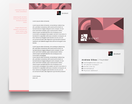
Business Card and Letterhead
Pitch Decks
Website Design


